
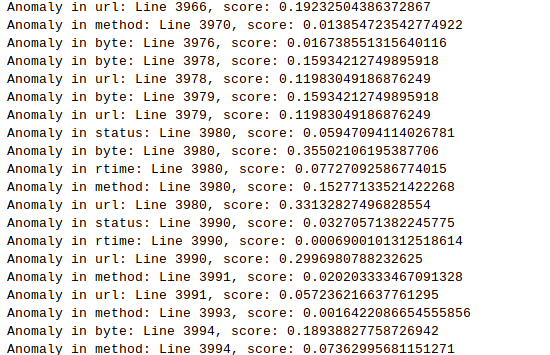
We can now make predicitions with the model! But the very first predictions we had were not that simple to interpret. We have multiple arrays of numbers which represent mean squared errors of a new log entry that has been processed…
About the graphs
Before getting deeper into the anomaly detections, we present 4 graphs that show the loss functions of different components using 3 different datasets and a combination of all 3.
In all training processes, the model was set to train with an early-stopping monitor which stops the training if 100 epochs (training cycles) pass without 0,001 improvement in the total loss value. The loss value is a statistical number, residual sum of squares, and represents the effectiveness of the model.
About the servers
3 Apache web servers running on Ubuntu 18.04 were exposed to the general Internet for a week. They only offered a very simple HelloWorld -page. Two servers are still running in Google Cloud gathering log data as we are approaching the project’s grand final.
Training set 1
This is an interesting training graph, the loss values are the lowest here, and towards the end they are closer to each other compared to other sets. This was the smallest dataset (780 entries) of the three, which explains this behaviour. It also tells that the data is quite homogenous which in turn can lead to oversensitivity when detecting anomalies and introducing new data.
Note that the y-axis in all graphs is logarithmic, so the lower the values become, the more sensitive the graph is. If it was linear, we would only see all the values hit the floor after 200 or so epochs.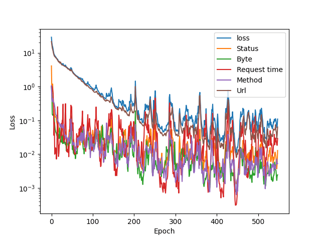
Training set 2
This was the only dataset that showed small improvements even after 1000 training epochs. The early stopping function didn’t trigger. This dataset was the largest with 2360 log lines.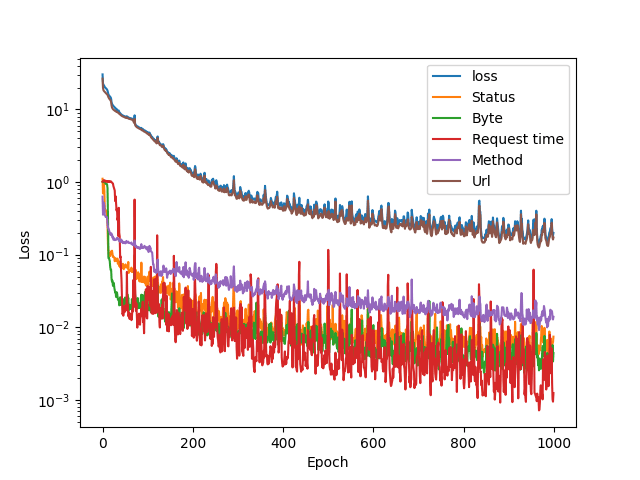
Training set 3
Request response times vary a lot as it is not only server dependent. This ecplains why the model is somewhat uncertain about request times. Size of this set was 1528 lines.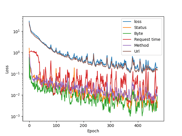
All the sets combined
The URL part contributes to the total loss value the most. This is understandable, as it contains 64 input values, each representing a character. I have a gut feeling that a tfidf tokenizer would perform better, but we have to see the models in action before we can make any deductions.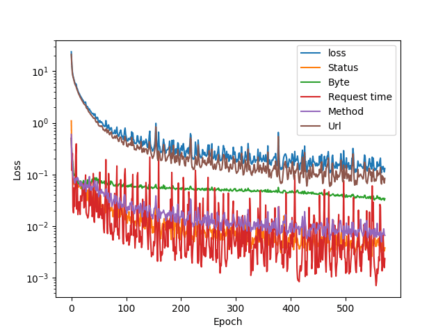
Loss metric in learning the server response messages size averages (the green line: byte) settles quite fast, and the loss variation is low.
Overfitting?
Autoencoder is a symmetrical model, and setting a bottleneck ensures that the model doesn’t just learn the values by heart. It has to learn to play by ear! The problem of overfitting in case of autoencoders is relatively simple to bypass: there has to be a bottleneck in the neural network that has less neurons than the model has inputs. Here is the relevant part of the code:
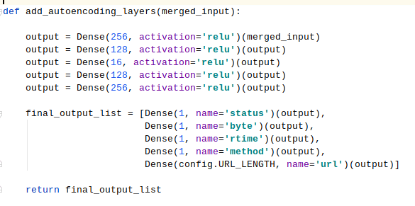
The bottleneck layer at the moment has 16 neurons, and we’ll probably experiment with different values. My personal understanding is that a tight bottleneck forces the autoencoder to make generalisations of the data, which is good up to a certain point.
The current state of the project: it seems to work!
The real question now is: how do we know from these numbers that a log entry is anomalous? Stay tuned, as Joni is doing some work with matplotlib for us to have more glorious charts to show! We are currently looking for anomalies in the training data, and a graph would be really nice instead of this kind of output:
A note on managing code complexity
The code is getting more complex all the time. To make it more readable and reasonably structured, a detailed flowchart could be constructed. This might take a day, and it is time taken away from the actual goal. However, maintaining the code by doing regular small cleanups makes the code more manageable.
There is already one file that contains parameters that can be changed before training a new model. As a learning opportunity this is also very good: analysing what has been done while constructing a decent flowchart of it is a valuable programming skill.
