
We have succesfully built an anomaly detecting autoencoder, and I’ll try to explain how it works using a trained model to analyse the actual dataset that was used to train it. We are also working on the actual deployment solution, and a Docker container looks like a good option with all the dependencies packed into one neat package.
What the autoencoder learns?
An autoencoder is really quite simple: it is symmetrical structure, that tries to reconstruct the original data with fewer parameters than it had originally.
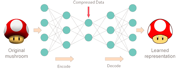
Image source
When a prediction is made, the same encoding/decoding process is initiated. If the data has similar patterns and distributions, the model has no trouble in reconstructing the data, and the reconstruction error is small. In case of an anomaly, the autoencoder will have difficulties, and the error will be higher.
Evaluation of autoencoder performance
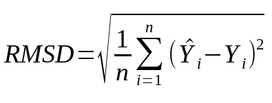
In the training process, we measure the autoencoders performance per variable by calculating root-mean-square deviation. The formula is used to calculate the difference between original and the predicted values. This is an important metric, as it is used in comparison to the values we get from new data.
In python, this is accomplished surprisingly easily with the help of two libraries:
numpy.sqrt(sklearn.metrics.mean_squared_error(after_ae, before_ae))
‘ae’ stands for autoencoder, and the variables ‘after_ae’ and ‘before_ae’ contain the whole training dataset (the sigma).
This metric is calculated for each of the 5 inputs and saved to reference. Here is a sample run on a small test dataset:

These numbers represent the average errors of the 5 items with the training data that was learned.
When previously unseen data arrives, we perform the same evaluation for an individual log line, and compare it to the training averages. If these errors are significantly different, we have an anomaly in our hands.
Looking for anomalies in the test data
Yesterday we got another plotting graph to work, which is very helpful to visualize the numbers that the program produces. I’ll use the smallest dataset we have as an example.
We had to train the models anew to get the RMSD numbers and save them. A more patient training scheme was also used to get a more accurate autoencoder. Here is the training loss plot for starters:
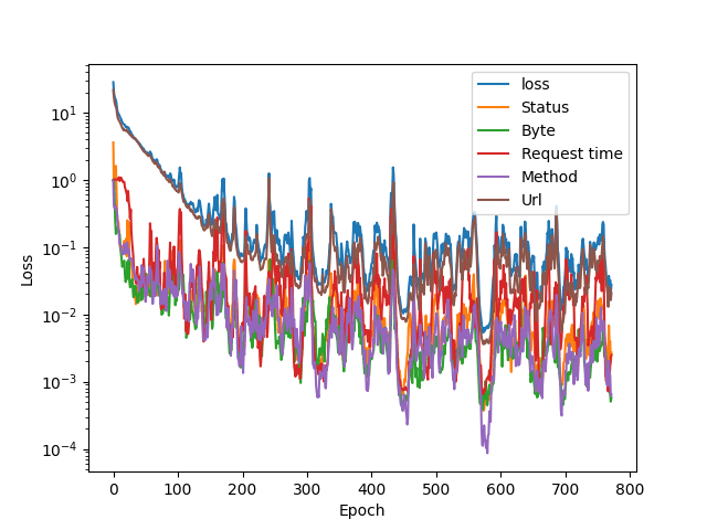
The patience was set to 200 epochs, so that low dip contains the values that were saved. A strike of luck? Here are the RMSD numbers (rounded a bit):
Status: 0.0196
Byte:   0.0211
Rtime:  0.0275
Method: 0.0118
URL:    0.0605
They are quite low. As the dataset was small with only about 800 lines, this model is very sensitive to new data. If something new comes along, these values are high when run against this particular autoencoder.
However, we are first running the training data itself against these averages, as there might be individual items that stand out. Note that the y-axis is again logarithmic.
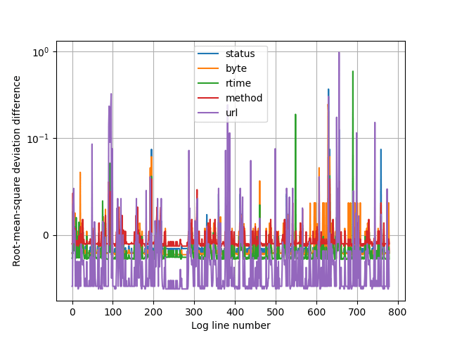
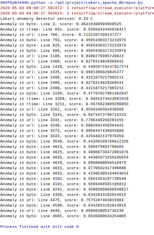
The higher the score, the more the line stands out from the average. Lets examine a few samples from the training dataset. There is numerical data also to help to determine the exact log line, as the graph doesn’t deliver it.
Sadly, the big URL differences are not that interesting, and that field is the most problematic anyway at the moment as we are talking about converting the textual URL request into numbers.
The logarithmic scale also exaggerates the differences, in reality the difference isn’t that large. The IP addresses have been cleared too.
But there are 2 green peaks: response time, lines 550 and 691.
"20/Apr/2020/07:22:36" "IP" "200" "12" "85376" "GET" "/index.html/" "HTTP/1.1"
"22/Apr/2020/14:14:12" "IP" "200" "12" "245290" "GET" "/index.html/" "HTTP/1.1"
These are deviations from the normal clearly. Average response time is under 1000ms.
An unseen status code is also interesting, the blue peak at the end is visible, but the difference is actually small, there is one hidden behind a purple peak at line 631 though:
"21/Apr/2020/16:31:03" "IP" "400" "350" "40" "GET" "/phpmyadmin/scripts/setup.php/" "HTTP/1.0"
The 400(Bad Request) doesn’t look special in any way, but we have to remember that the individual values are affected by other values as the autoencoder reconstructs the log line. We also have to determine what gets reported and what doesn’t.
The combined dataset analysis
The dataset was quite small and uniform, so I’ll do the same for the combined set we have. The data is accumulating as we speak, so we’ll be able to use larger datasets soon. Here is a the new training plot for the combined set: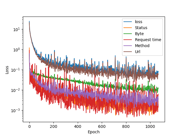
The error numbers are somewhat higher than compared to the smaller set:
Status: 0.0265
Byte:   0.0820
Rtime:  0.0206
Method: 0.0399
URL:    0.1580
As the dataset is much more diverse than the small set, the logarithmic y-axis doesn’t serve it’s purpose anymore. Switching back to linear y-axis looking for anomalies in the set: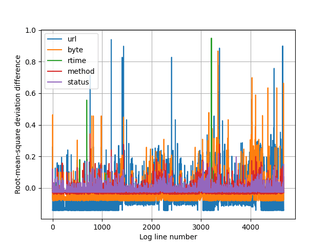
I set the textual reporter’s threshold to see all the values above 0.4. Method and status codes are all ‘normal’. Here is the text output:
Lets see what we have, I edited the parts out which we are not using in detection along with few duplicates.
The format is: method, response size, response time, request, url
Long request times:
"200" "12" "411991" "GET" "/index.html/"
"200" "12" "249967" "GET" "/index.html/"
"200" "12" "245290" "GET" "/index.html/"
"400" "226" "10327384" "POST" "/HNAP1//"
Anomalous URL’s:
"404" "276" "496" "GET" "/w00tw00t.at.blackhats.romanian.anti-sec:)/"
"404" "276" "367" "GET" "/Temporary_Listen_Addresses/SMSSERVICE/"
"400" "349" "57" "GET" "/card_scan_decoder.php/?No=30&door=%60wget"
"404" "275" "134" "GET" "/App//?content=die(md5(HelloThinkPHP))"
"404" "275" "145" "GET" "/images/stories/filemga.php/?ssp=RfVbHu"
"404" "196" "134" "GET" "/_cat/indices/?bytes=b&format=json"
"404" "196" "101" "GET" "/solr/admin/info/system/?wt=json"
"404" "196" "126" "GET" "/Struts2XMLHelloWorld/User/home.action/"
"404" "196" "131" "GET" "/theblog/license.txt/"
"404" "196" "209" "GET" "/Telerik.Web.UI.WebResource.axd/?type=rau"
"404" "196" "141" "POST" "/Admin1a23985b/Login.php/"
"200" "12" "141" "GET" "/index.html/?a=echo%20-n%20HelloNginx%7Cmd5sum"
"404" "196" "121" "GET" "/images/stories/filemga.php/?ssp=RfVbHu"
"404" "196" "145" "POST" "/p34ky1337.php/"
Other interesting qualities:
There was almost 1000 lines originating from a single IP address. Someone clearly run an enumerator to different .php URL’s. They were ignored by the detector, as this was normal, except for two:
"404" "275" "281" "POST" "/whoami.php.php/"
"404" "196" "145" "POST" "/p34ky1337.php/"
The first was the only one to have the double .php extension in it, and the other one did not 😀
From another similar enumeration, from a different IP address, but a very familiar looking php enumeration pattern gave out additional lines:
"404" "196" "126" "POST" "/vendor/phpunit/src/Util/PHP/eval-stdin.php/"
"404" "196" "128" "GET" "/secure/ContactAdministrators!default.jspa/"
"404" "196" "171" "GET" "/weaver/bsh.servlet.BshServlet/"
Lines similar to the first one were reported 6 times. Interestingly enough, the high score was in the attribute ‘byte’. It seems that the relationships encoded by the autoencoder are at work.
These results are promising. The log lines spotted by the detector are clearly different.
Throwing a few needles into haystack
As an additional experiment, I’ll throw in a bunch of Joni’s handcrafted log lines to the dataset that should not be possible to get, or would be alarming to see on a web server. These 12 bad lines were not part of the original training set, and some of them are subtly altered, for example:
"200" "2143" "168" "POST" "/test.php/" "HTTP/1.1"
Just an innocent php request, which in this case really should NOT be answered with 200(OK), along with 2145 bytes of data…

They are shining really brightly! 12 of the tallest pillars are the 12 lines manually inserted into the data 🙂 I had to tune the plotting range, as some of the values went really high, getting scores in the range of hundreds in some attributes.
Next steps
Tuning the model further, especially looking at how URL lines are processed is on the menu. The problem of not having real anomalous data makes it somewhat difficult to determine the actual performance of the model.
The only resource the project has had is time. And there is not too much left. The project’s final product is going to be a prototype that needs to be tested in real world scenarios to further enhance it’s performance.
Good sources FTW
Throughout the project, towardsdatascience.com has time and again been a valuable resource with good quality blog posts about machine learning subjects.

1 Comment